 Ben
Ben I’m thinking it might be good to start producing some kind of content aside from infrequent Github updates. To be honest, I use a lot of these concepts on a daily basis, but really don’t get the chance to dig deep into them. So writing this is as much about myself learning this stuff as anyone else.
So ROC curves come in really useful in my work. I’ll explain a bit more about what I use them for later on, but for now let’s start with my favorite part: The history.
Is it a bird? A plane?
ROC stands for Receiver Operating Characteristic, a name that makes no sense out of historical context. It was developed in World War II as a way to measure the performance of radar operators. Operators had to detect whether a blip on a radar screen was an enemy ship or not. Essentially, a binary classification problem. One operator’s (i.e. receiver’s) ability to detect enemy ships was able to be compared to others and to a random guess.
Sometime around 1970, ROC curves came into vogue in measuring the performance of diagnostic tests. And nowadays you can’t swing a Random Forest without hitting a few ROC curves. And there’s good reason why.
ROC curves: A class of their own
Usually in classification tasks, the go-to measure for performance is accuracy. That usually means the percentage of correctly identified observations over the total number of observations. Scikit-learn’s documentation describes it better than I ever could.
You could imagine this in the enemy ship identification task where a radar operator’s accuracy might be measured by the percentage of ships that were correctly identified as either enemies or not enemies over the total number of ships observed.
So imagine a scenario where two operators, Alice and Bob see six ships. Two of them are enemies, four of them are non-enemies. Alice identifies only one of the enemies, but doesn’t mis-identify any of the non-enemies. Bob identifies both enemies, but also identifies one non-enemy as an enemy. Both of them have accuracies of 5/6, or 83%. So it doesn’t matter which one have manning the radar, right?
Well, maybe. What if you told Bob to only mark as enemies ships he was pretty certain were enemies? What if you told Alice to be less strict with her identification? You can think of their “certainty” as a threshold, past which they will mark an observation as an enemy.
This kind of thinking is useful if you had a situation where you really didn’t want to let any enemies get by or a situation where identifying a non-enemy as an enemy might have really dire consequences. That’s the idea behind the ROC curve. It allows you to compare your operators at different thresholds on one plot. The ROC plots the operator characteristics at different thresholds on two axes:
True Positive Rate (TPR): The number of correctly identified positive class (e.g. enemy ships) over the total number of positive class. This is also referred to as recall.
\[\frac{True\ positives}{Total\ positives}\]False Positive Rate (FPR): The number of negative class (e.g. non-enemy ships) mis-identified over the total number of negative class.
\[\frac{False\ positives}{Total\ negatives}\]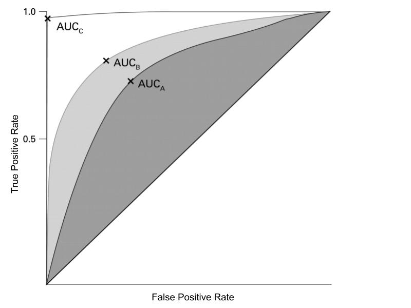 Adapted from: https://jcp.bmj.com/content/jclinpath/62/1/1/F2.large.jpg
The curve is all possible thresholds, from 0 to 1.0. Somewhat counterintuitively, higher thresholds correspond to a leftward movement on the curve. So with higher thresholds, fewer of the positive class are likely to be identified (True Positive Rate), but fewer of those identified as positive are likely to actually be negative (False Positive Rate). Looking at the figure above, a “perfect” model would have a curve that lays perfectly on the left and top side of the chart. That means that every observation it classified as above 50% probability is in the positive class (100% TPR). A “coin flip” model would lie on the diagonal, indicating a 1:1 relationship between TPR and FPR.
Under the Hood (or Curve)
The real power of the ROC curve, as I see it, is the ability to compare different models. Typically, I use it as a measure of how well the model’s predicted probabilities correspond to reality; whether observations with high predicted probabilities are actually likely to be in the positive class. The ROC curve provides a single score evaluation of this match with reality; the Area Under the Curve (AUC) score. Which curve? Why the ROC curve of course.
The AUC score has an simple, powerful interpretation: The percentage of the time with which a model assigns a higher probability to a member of the positive class than it does a member of the negative class. With the “perfect” model, we have the entire chart under the curve, so an AUC score of 100%; it always ranks the positive class higher than the negative class. With the “coin flip” model, it’s a 50/50 chance a member of the positive class will actually be ranked higher.
I find the ROC curve to be an informative visual and the AUC score to be a simple, easily explainable measure of model performance. But there’s a slew of model diagnostic tools out there and the AUC score is just one of many ways of measuring performance of binary.
Addendum on Imbalanced Classes
One more thing: I learned recently that this AUC measure is sometimes misleading for situations in which you have imbalanced classes (ratio of 4:1 between number of observation per class). I learned this from one of Andreas Mueller’s advanced machine learning workshops, though I can’t find a specific reference to the discussion. However, here’s a Kaggle notebook that breaks the issue down.
So imagine the situation where you have 10 positive class and 100 negative class. If your classifier labels half the positive class negative and half the negative class positive you’d get:
TPR = \(\frac{5}{10}\) = 0.50, FPR = \(\frac{50}{100}\) = 0.50
Not a great classifier. But now imagine you have a new dataset with 1,000 negative class and the same number of positive class and your classifier still classifies half of each class wrong:
TPR = \(\frac{5}{10}\) = 0.50, FPR = \(\frac{500}{1000}\) = 0.50
Just looking at those rates, we’d say the classifier is performing the same on this more imbalanced dataset. However, in the first dataset, 10% of the observations classified as positive were actually in the positive class and in the second dataset only 1% of the observations classified as positive were in the positive class. This metric is referred to as Precision: \(\frac{True\ positives}{Predicted\ positive}\)
In the case when a false positive is particularly undesirable (e.g. fraud prediction, clinical tests), it might make sense to use precision in evaluating your model. There’s a precision-based analogue to the ROC curve called the Precision-Recall curve.
Hope you enjoyed this post and found it informative. Feel free to reach out if you have any questions or comments!